

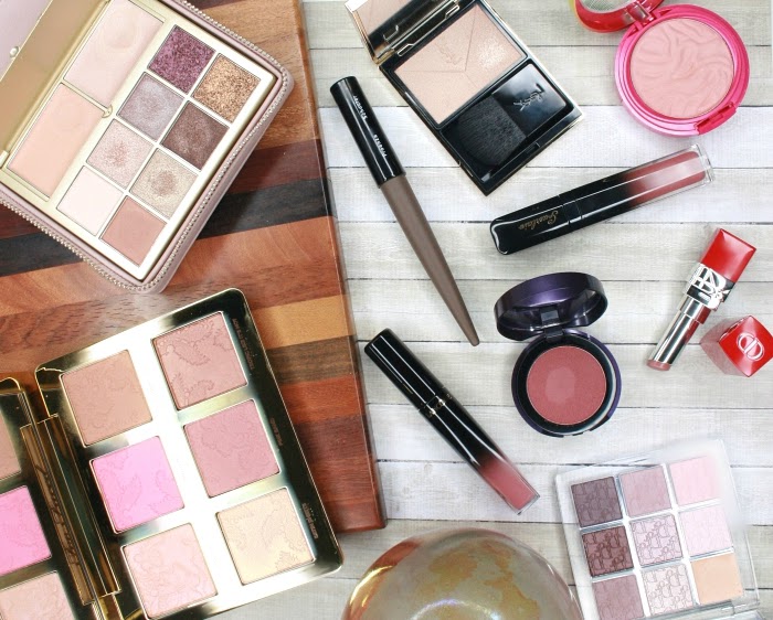
With Christmas just around the corner, holiday collections have invaded department stores. In fact, they might be sold out long before Christmas - the annoying result of new collections launching a whole season in advance. This year again, to my disappointment, most brands have released very classic, boring holiday collections centered around one theme: GOLD EVERYWHERE. I have nothing against gold, but when everybody has been doing gold for Christmas for several years in a row, it gets old. Creativity, trend setting anyone??
Anyway, Dior is surfing the gold wave with their collection called Golden Shock (I'd like to name a collection Gold Indigestion...), however beyond the packaging and nail lacquers, a lot of the new products have quite interesting shades to offer. I found both new eyeshadow palettes to be stunning in pictures, and decided to go the less traveled path and purchase Golden Reflections, a cool harmony of grey and bronze.

There's not much gold about it really and Metal Reflections would have been a more suitable name. It's a really interesting combination of platinum, white gold, silver and golden bronze, really unique in my (rather large) collection. Unfortunately I wasn't able to find a tester before I made the decision to purchase it online, so I was a little worried that such a cool toned palette might not work so well on my neutral to warm complexion. I was also concerned about the quality of the shadows, because Dior's creations sometimes lack pigmentation. So, how did it go?

The 2 lightest color, a beige and a lavender grey, are best described as mattes containing tiny gold flecks. They don't have a pearl or satin sheen, so the base is definitely matte. These two are moderately pigmented but easy to build on the lid provided you use a good base.
The center diamond is a sparkle explosion: the metallic champagne sparkles don't adhere to the skin too well (again, primer needed) but they work well to bring light to the inner corner of the eye.
The golden bronze shade is a gorgeous buttery shadow with a soft, luminous pearl finish that is easy to apply and blend. It is the only shade in this palette that doesn't cause any fallout.
The graphite gray looks stunning in the palette, but it's really the problem child here. It's dry, powdery, with sparkles and grains of powder flying around and landing all over the cheekbones during application. It doesn't look smooth or even and kind of sits on the surface of the skin like grayish dust. It's hard to apply precisely because it moves around a lot, it doesn't blend well, and it causes A TON of fallout. Come on Dior, you've never done grays before? What happened here?

All these shadows are quite powdery and again, you need a good primer to make something nice out of this palette. The level of pigmentation is medium, but as is often the case with Dior formula, they perform better on the eyes than swatched. So yes, the swatches look weak, but it does look better on the eyes (I wish I had good enough lighting to show you a decent picture when worn, I'll try again this week-end).
Surprisingly, the wear time is quite good for me when used on top of a primer - I wasn't expecting much considering the shadows are powdery, but they do last all day on me. The major fallout crisis happens at the time of application, and once set, there aren't too many sparkles falling on my cheeks.

The color combination is really inspiring here, and I've done looks I had never tried, or thought of, before. The cool shades work perfectly well on my warm complexion, and I've discovered that bronze and gray makes for a stunning metallic look.
Overall: with one disastrous shade and the others being mediocre to good, I don't think that Dior did a good job with this palette. It's hard to work with and sometimes a PITA. For this reason, I can't recommend to throw $60 on this. On the other hand, I don't plan to return it because I really like how the shades work together and the variety of looks I can do with it. If you're attracted to this color combination, I would suggest swatching in store before buying, to make sure you will be ok working with the disappointing texture.
Where to buy: nordstrom.com , macys.com, neimanmarcus.com , or your usual Dior retailer.
The product featured in this review was purchased by Lulle. I received no compensation to write this post, which only reflects my personal opinion. This post contains affiliate links.


The only Dior palette I have is Gris Gris which has cool tone greys and a shimmery black. While I really like the quality of that, Dior is just so inconsistent with these palettes. It's disappointing because it is so beautiful!
ReplyDeleteIt is very disappointing because they look so amazing, but you never know in advance how well they are going to perform. If the texture and pigmentation were more consistent I would buy 3 or 4 more of their 5-color palettes in a heartbeat!
Delete