
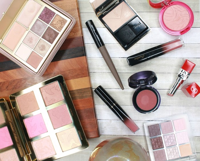
Affiliate Links

Energy Noir. For some reason the name of this year's fall makeup collection by Tarte resonates with me. Is it the French adjective (noir means black in French)? Or the fact that it evokes a dark night, a mysterious black moon, with an aura of magic? I couldn't tell, but I knew I wanted the Energy Noir Clay Eye & Cheek Palette as soon as I first saw it. Beyond the name, I was also seduced by the muted, smoky colors it features, with a strong focus on purple. Doesn't it look perfect for fall?

I was a bit unsettled by the first reviews I read, especially Temptalia's, but when Tarte included this palette in their 30% off Friends & Family Sale a few weeks ago, I couldn't resist and I ordered it, before I even had the chance to see it in person.
So, should I have listened to the reviews, or was this impulse purchase a good move?

Energy Noir palette feature 8 shadows: 6 eyelid shades and 2 deep colors that are meant to be used as liners, Power Plum and Lunar Eclipse (the two narrow and long pans at the bottom). It also contains a blush and a small highlighter for the cheeks and eyes. Most of the shades in this palette are matte. There are only 2 shimmery shadows, plus the highlighter.

Let's take a look at the performance of each individual shade:
- Full Moon, the matte ivory, kicks off a lot of excess powder when I swirl my brush in the pan, and it causes a good amount of fallout. It only has medium pigmentation, so it ends up looking semi-sheer and doesn't cover the imperfections on my lid. I tried to use it as a base on the entire lid but it doesn't work well that way, it's just too sheer no matter how much I try to build it. For me it works best on the brow bone, where I swipe it to diffuse the top of my crease shade.
- Charged Up, a shimmery taupe, feels very soft and buttery. I like that despite the shimmery finish it doesn't emphasize the texture of my lids too much. It's nicely pigmented but not super intense, so being close to my skin tone it doesn't show up on me as much as expected.
- Dark Drive, a deep matte brown is very intense and pigmented, but it feels dry, stiff and doesn't blend well. It looks sheer on my arm swatch, but it really isn't, the problem is just that it doesn't sit well on my skin because of its dryness.
- Stone Unturned, a matte medium greige, is very soft and doesn't cause any fallout at all. It has medium-to-good pigmentation, but the lack of intensity makes it fairly uninteresting as a lid shade. For me it works best in the crease.
- Up To Slate is a shimmery grayish purple that looks mostly gray on my lid. Its texture is very similar to Charged Up: soft, no fallout, doesn't make my lids look dry/crepe-y too much, and medium pigmentation. Like Charged Up, I find its lack of intensity on my eyes a little disappointing.
- Misty Mauve, a matte, cool mauve is very similar in texture to Stone Unturned. It's soft, fairly well pigmented and doesn't cause fallout. Again, the intensity is a bit lacking, it looks very muted on (and it also looks warmer on me, everything does!).
- Power Plum: this deep matte purple is highly pigmented and intense, which makes it great to use as a liner shade as intended. It's also dry, powdery and harder to blend, so it doesn't work well as a shadow.
- Lunar Eclipse, a blackened espresso brown, is the other liner shade and has exactly the same texture. I like that neither causes fallout, and they also work well on the waterline or to tightline.
- Unearthed, the blush, is a rosy beige that ended up looking really warm on me. I appreciate the fact that Tarte went for this warmer shade rather than a mauve or plum for the blush, I think it still plays with the eye shades really well and it balances out the final look, avoiding an excessively cool result. It has medium pigmentation that can be built easily by layering. I like to use a denser blush brush on this finely milled powder, something too soft won't pick up much color.
- Crystal Spark is a champagne highlighter with a metallic finish. Used with a light hand, it imparts a nice glow to the skin. The pan is really tiny, so it's quite impractical to use as a cheek highlighter as only small brushes fit in. It works well under the brow or in the inner corner of the eye.

As I said in the beginning, I bought this palette before I had a chance to swatch it, and to be perfectly honest, I wouldn't have purchased it if I had. Most of the shadows are matte and dry, and the ones that are softer still lack intensity. I'm not returning it, because I think that the textures are still workable, but they're definitely not very good mattes. This is my first Tarte palette and I can't say that I'm very impressed with the quality of their formula!

Another source of disappointment for me is the general lack of intensity/saturation of the colors. I knew they would be muted - that's the very reason I loved the color combination of this palette. But on my eyes, they tend to turn muddy and dull. And I should add that I always apply the shadows on top of a primer. Not only that, but I even used a white base (by Nyx) to try and make them pop more. It helps a bit, but still, my makeup ends up looking flat and more boring than expected. Maybe the colors just don't work well with my skin tone and would look better on someone with fairer skin or cooler undertones?
 |
| Suggested day look in the leaflet that comes in the palette: the ivory Full Moon is supposed to be the lid color but it's clearly too sheer |
 |
| A look using the brown shades plus the purple liner |
 |
| A look using the purple shades |
An interesting thing to note is that some of the looks I created seemed to look much better in artificial light. The shimmery shadows in particular came to life and showed more depth than in natural sunlight. It would be acceptable considering this is a fall palette, except that I live in San Diego and fall here is sunny!
On the other hand, one thing that I like about this palette is that the mauve and purple theme really emphasizes the green in my eyes. It makes my irises look greener and brighter!
Overall: this palette should be an easy pass for most. The quality is in the mediocre to okay-ish range, and the colors don't look as pretty on the eyes as I hoped. If you're really attracted to its muted, moody purplish vibe as I was, I would strongly suggest trying it ON YOUR EYES in a store before you make a decision (although you might give up just after swatching the shadows on your arm...).
Where to buy?
The product featured in this review was purchased by Lulle. I received no compensation to write this post, which only reflects my personal opinion. This post contains affiliate links.


No comments
Unfortunately the comment system does not work on mobile phones at this time :( If you see this message and leave a comment, I will be unable to approve it, I'm really sorry about this issue!